Sasol Delight

A Humanised Approach to Branding
Sasol Delight’s new brand direction was grounded in humanisation so we could establish an emotional connection with our target audience. We set out to create a brand personality that consumers could truly connect with, thereby creating an atmosphere of trust and credibility which enhances each customer’s shopping experience.
Our human-driven creative direction allowed us to create a deeply relatable brand personality and content style. This filtered through Sasol Delight’s brand messaging and solidified our tone of voice as friendly, enthusiastic and approachable. Our content managed to deliver on the brand’s personality and values by establishing meaningful connections with each service station’s surrounding communities.
Sasol Delight is targeted towards the multiple personalities of South Africa, from travellers and commuters to Sasol regulars, parents dropping in for a quick after work stop and everyone in between.
Our aim was to help them become the preferred on-the-go food and drink retailer for motorist and non-motorists alike.
To do this we adopted a customer-centric approach that exceeded customer expectations by staying true to Sasol Delight’s fast, fresh, and friendly approach. This is what truly differentiated us from other non-fuel retail competitors.

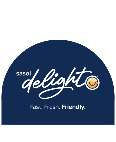
Our Logo
Our Delight Icon
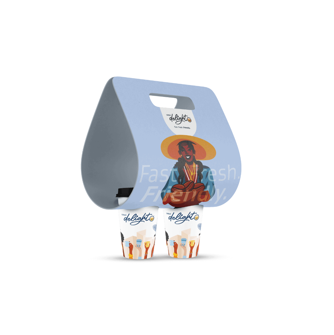
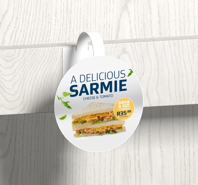
Our Holding Device
Our Logo
Our Delight Icon
Our Holding Device
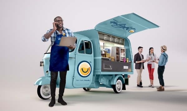
The Good Nation Station.
Sasol Delight is an honest, cheerful, and down-to-earth brand that resonates with all South Africans. To live up to the brand’s reputation, the design of all service stations not only had to deliver more than the customer was expecting, but also had to create an infectious culture that personified the brand and make every fuel stop a memorable experience. These goals were realised by leading with a customer, environment and brand-centric approach instead of allowing architectural and physical requirements to dictate the design.
Brand Tone
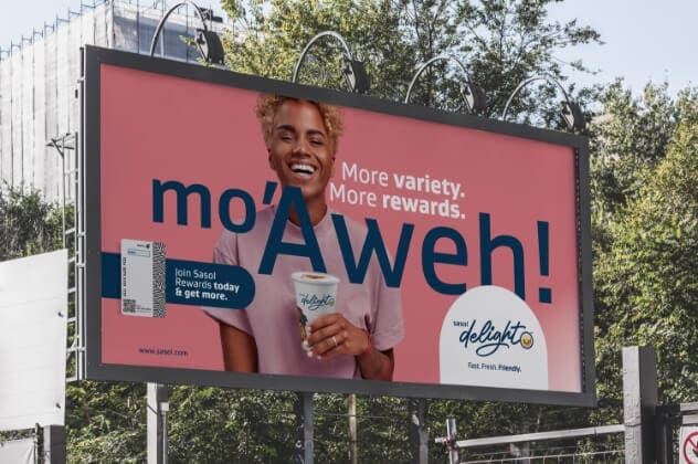
The Sasol Delight brand tone and messaging will always resonate with customers and keep the customer-centric approach in mind. The tone is friendly, young, enthusiastic, and approachable – ensuring that customers always feel connected to the brand.
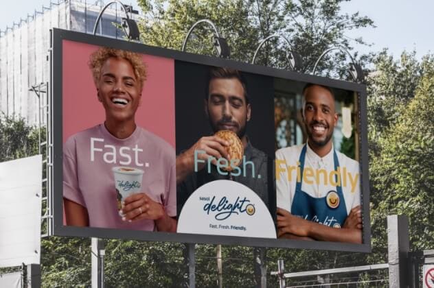
Positioning Line
Fast.
Fresh.
Friendly.
Brand Positioning.
Our aim was to change the perception of forecourt retail by always delivering beyond customer expectations. With our customer-centric approach, we showed that we are for the storytellers, the innovators and game changers, the creators and everyone in between.
We are for the people. We are for South Africa.
Basic Toolkit

Logo
Logo in holding device

Brand icon

Colours

Typography

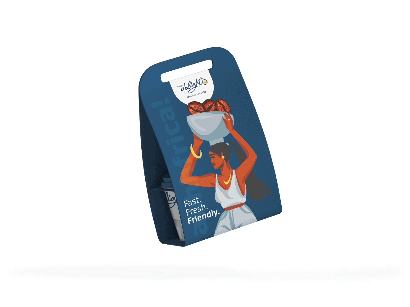
Iconography

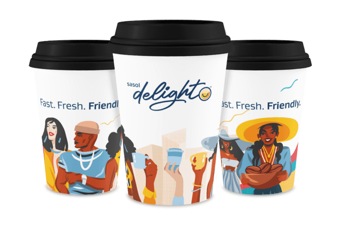
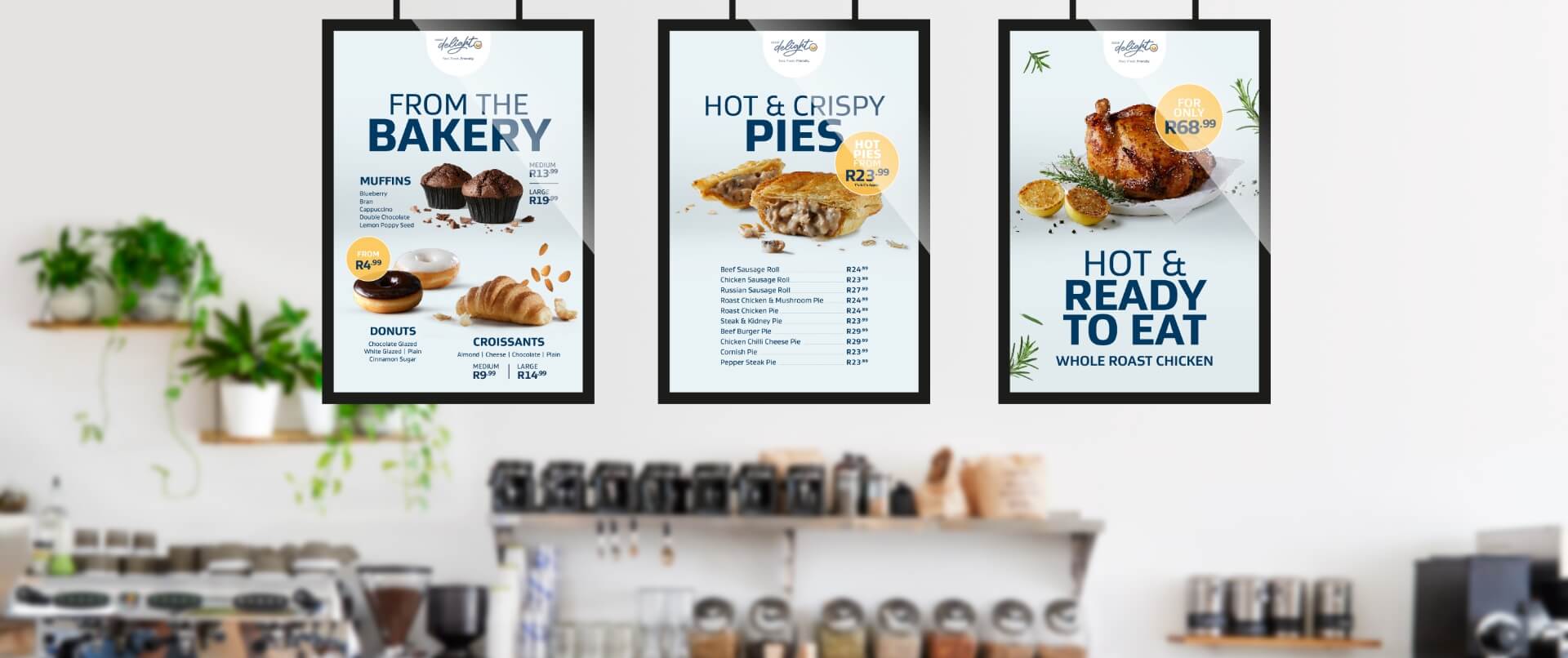
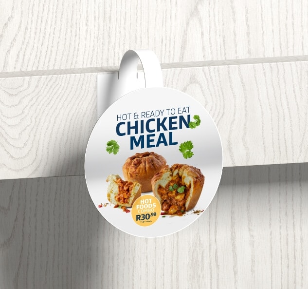
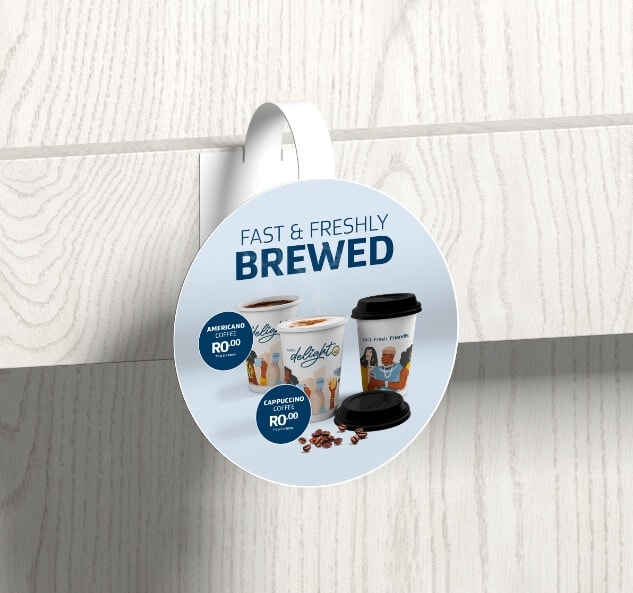
Photography
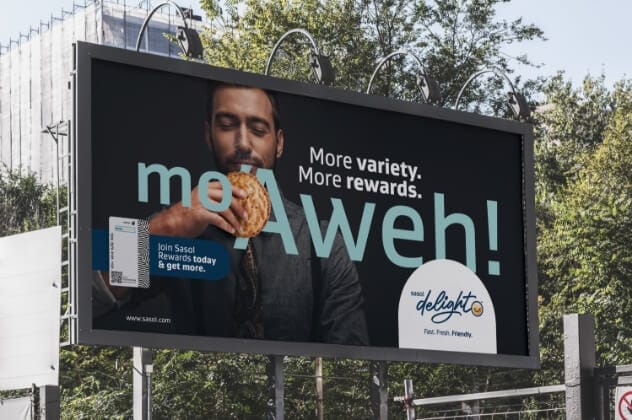
The creative direction was used to construct the final Sasol Delight CI which was used to guide future creative. The decision was made to use actual faces in all marketing efforts and brand collateral, as it helped to accurately represent our ideal target market and enabled customers to relate to our brand. The design style remains fun, young, and fresh, showcasing why swinging by any Sasol Delight service station should be a no-brainer.


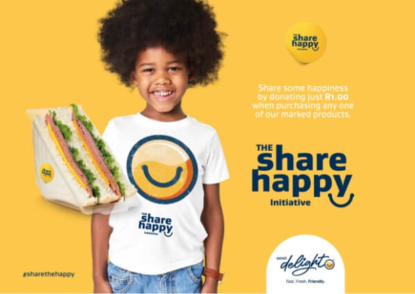
Initiative Identifier